How to draw a fantasy map: a DM's guide to hand-drawn worlds
How to draw fantasy maps for D&D in Procreate, Photoshop or Affinity — coastlines, mountains, forests and labelling, plus when hand-drawing beats a map generator.
There is a moment in most campaigns where the generated map stops being enough. It is fine, it is legible, and it looks exactly like every other map made in the same tool. The world you have been describing for eight sessions deserves something that looks like it was made for it.
Hand-drawing a map is much less difficult than it appears, because fantasy cartography is not really drawing. It is the same handful of shapes repeated with variation.
Start with the region, not the world
The most common mistake is beginning with a continent.
Players do not use world maps. They use the area they can cross in a few weeks — the region with the towns they know, the roads they travel, and the mountains they have to go around. That map gets opened every session. The continent gets admired once.
Draw a region roughly 300 by 200 miles. That is big enough to hold a campaign and small enough that every feature on it can mean something.
Coastlines first, and draw them badly
Coastline sets the character of everything else, and it is the thing people most reliably overwork.
Real coastlines are fractal — irregular at every scale, with inlets inside bays inside gulfs. A carefully drawn smooth curve reads as artificial immediately. The technique that works:
Draw it fast. One continuous stroke, faster than feels comfortable, letting your hand wobble. Then go back and fix only the sections that read badly.
Vary the scale of the irregularity. A few big bays, more medium inlets, lots of small ragged detail. If everything wobbles at the same frequency it looks like a scribble rather than a coast.
Add islands last, in clusters. Islands scattered evenly look wrong. Real archipelagos clump, usually parallel to the coast they broke off.
Then mountains, then rivers
Order matters here and it is the difference between a map that looks right and one that is subtly wrong.
Mountains define the map. They are where the rain stops, where borders sit, and where rivers begin. Place ranges before anything else inland. Draw ranges as a line of overlapping peaks with the shading consistently on one side — pick a light direction and never break it. That single consistency does more for a map’s credibility than any amount of detail.
Rivers flow downhill from mountains to the sea, and they do not split. Rivers join going downstream; they only fork at a delta at the mouth. A river branching halfway down its length is the most common and most noticeable error in amateur fantasy maps. Rivers also do not cross each other, and they do not run out of a lake at two different points.
Forests fill the gaps that get rain. The windward side of a mountain range is wet and forested; the leeward side is dry. You do not need to model climate seriously, but putting a desert directly downwind of a range and a forest upwind of it will make the map feel considered.
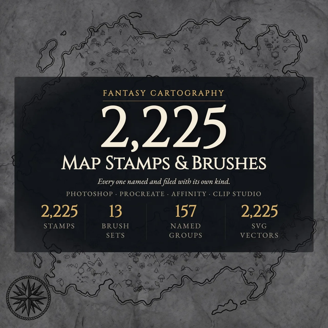
The part that stops most DMs is not the composition, it is drawing the two hundredth tree. Brush and stamp sets solve exactly that: a forest brush paints a treeline along a stroke, a mountain brush builds a range, and stamps drop in cities, compass roses, cartouches and sea monsters that would each take an hour to draw. The composition — where the range goes, where the river runs — stays yours.
Brushes versus stamps
Worth understanding the distinction, because they solve different problems:
Brushes repeat along a stroke. You use them for anything that comes in quantity — forests, mountain ranges, hills, marshes, coastal shading, hatching. One stroke becomes forty trees.
Stamps place a single fixed object. Cities, castles, compass roses, title cartouches, scale bars, ships, sea monsters. These are the elements that need to be drawn once and drawn well, and they are the ones most worth not drawing yourself.
A good workflow is brushes for terrain, stamps for the things that carry the map’s personality.
Labelling, last and carefully
Text is what separates a drawing from a map, and it is the stage most likely to ruin one.
- Label last. Always. Placing text before the terrain is settled means moving it later.
- One display face, one body face. The title can be elaborate. Place names should be readable.
- Curve labels along features. Region names follow the shape of the region; river names follow the river. Straight horizontal labels on a curved coast look pasted on.
- Size by importance. Capitals larger than towns, regions larger than settlements. This is the map telling the reader what matters.
- Leave things unlabelled. Blank areas with no name are more evocative than complete coverage. A forest with no name on a map is an invitation.
Making it look old without overdoing it
Aged-parchment effects are where good maps go to die. The failure mode is always the same: the texture becomes the first thing you see.
What works:
- Off-black ink, never pure black — a dark brown or deep sepia
- A parchment texture at low opacity, under the linework, not over it
- A simple border, because framed things read as documents
- Slight, uneven ink weight, as though drawn with a real pen
What does not:
- Burned or torn edges
- Heavy coffee staining
- Drop shadows on the landmass
- Aggressive noise or grain filters
The test is whether you notice the age effect before you notice the geography. If you do, reduce it.
When not to draw it yourself
Hand-drawing is the right answer for a regional or world map you will use for a year. It is the wrong answer for the map of a tavern the party will visit once.
For encounter-scale maps, premade battlemaps are faster and better — a hand-drawn tavern interior takes two hours and a premade one takes thirty seconds. Our comparison of map generators versus premade maps covers where each fits, and how to make your own battlemap covers the encounter-scale version of this workflow.
The practical split most DMs land on: draw the world and region maps by hand because they are the campaign’s identity, and use premade maps for everything the party fights on.
Getting it to the table
A finished map has two destinations, and they want different files.
For players, export a version with only what they know. Unexplored regions blank, secret locations absent. The fog of war tool handles revealing it progressively if you are running digitally.
For virtual tabletops, export at a resolution that stays legible when zoomed — 4000 pixels on the long edge is usually enough for a regional map. If you are running travel across it, the hex coordinates tool will overlay a hex grid at the scale you want.
For print, if you want a physical map for the table, the map splitter will divide a large map across A4 or Letter sheets to be tiled together.
The short version
Region before world. Coastlines fast and loose, mountains before rivers, rivers that never split going downstream. Consistent light direction on every peak. Brushes for the repeated terrain, stamps for the things that carry personality, labels last and curved along features. Then stop before the parchment texture becomes the point.
Frequently asked questions
- What software is best for drawing fantasy maps?
- Procreate on an iPad is the most popular choice for hand-drawn fantasy cartography because of its pressure sensitivity and brush handling. Photoshop and Affinity Designer both work well and are better for text and layout. Inkarnate and Wonderdraft are faster but produce a recognisable house style.
- Do I need to be able to draw to make a fantasy map?
- No. Fantasy cartography is mostly repeated symbols — the same mountain shape forty times, the same tree cluster a hundred times. If you can draw one convincing mountain you can draw a mountain range. Stamp and brush sets remove even that requirement.
- How do I draw a realistic coastline?
- Draw it fast and loose rather than carefully. Real coastlines are fractal and irregular, and a slow, considered line looks artificial. A good technique is to scribble the rough shape with a shaking hand, then clean up only the parts that read badly.
- Should I draw my world map or my region map first?
- The region. Players interact with the area they can travel across in a few weeks, not the continent. Detailed regional maps get used every session; world maps get looked at once and then hang on a wall.
- What is the difference between a map brush and a map stamp?
- A brush paints repeating elements along a stroke — forests, mountain ranges, coastal shading. A stamp places a single fixed object, like a specific city icon, a compass rose or a sea monster. Most cartography sets include both because they solve different problems.
- How do I make a map look old?
- Restraint. A parchment texture at low opacity, slightly off-black ink rather than pure black, and a border. Heavy burning, tea stains and torn edges usually read as a filter rather than an old document.
Keep reading
From the shop
Battlemaps, spell cards, and magic item cards, ready to print.
Browse MakeMythic on Etsy →